Tuesday 9 April 2013

TASK 3 - GRAPHIC TYPES

Pixel art


Pixel art is a specific type of digital raster imagery. It is never vector. It involves the precise arrangement of pixels that, when zoomed out, reveal a completed picture with it's own stylized look. It isn't as common in computer games as it used to be, but we still see it occasionally in modern day games.
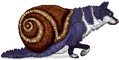
(An example of pixel art created by myself using MS paint. MS paint is considered by many an inferior and unprofessional arts program. However, it is excellent for pixel work, and it's simplicity makes it a good starting point for amateurs.)

Pixel graphics were used from the very first arcade games back in 1950s; at this time, however, the kinds of graphics used would be very simplistic ones, shapes made of of 2 or 3 pixels. This can hardly count as pixel 'art', but as time went on and more advanced 8 bit and 16 bit machines came into use, the resolution could be increased, meaning more pixels could be used. Simplistic shapes were used from the limited pixels to make recognisable characters such as was seen in 'Space invaders'. Games such as 'Mario cart', emphasized the features of their characters to make them more easily distinguishable from one another and more recognisable with the limited amount of pixels. That is why old game characters often have a very characuture look about them.

Pixel art was very popular in older games because of the limited amount of detail the systems could manage, but apart from that, as systems evolve, pixel art could be eventually be made bigger, it also looked very pretty in some cases, and was easier to produce than larger, more detailed art. It was used to great effect in classic games such as 'Legend of Zelda' and 'Sonic'. Most pixel games at this time were platform games, but they were not limited to this. Games such as 'Wolf' by sanctuary woods (DOS), used the simplicity of pixel art to utilize the remaining system resources to create a massive top-down explorable environment.

('Wolf' - 1995. An older example of top down pixel art in games)

In 1980, 'Q-Bert' went a step further, trying something completely new with pixel art; In order to create an apparently '3D' environment, they used a form of pixel art that is at an angle, called 'isometric', or sometimes referred to as '2.5D'. (Or strictly speaking, 'dimetric'.)
This process meant that games could display the world from a few different angles, giving the environment a much more explorational and 'real' feel while still keeping the limited computer resources in check (Without the need of having to use a 3D processing engine).
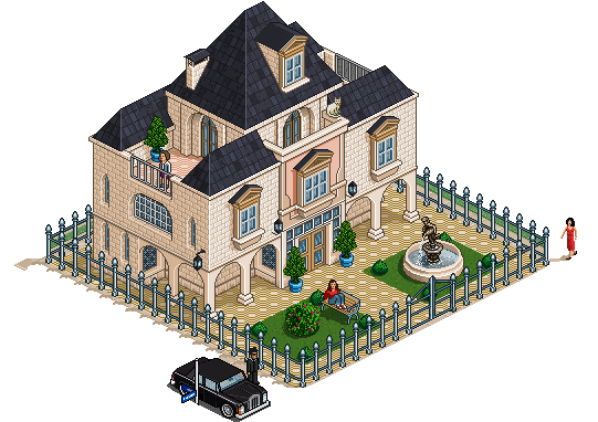
(An example of isometric pixel art. Giving the illusion of 3D)

The problem with pixel art in video games is that it cannot usually be scaled without losing resolution or distorting the image. This makes it difficult porting a game to different devices, and so older games can normally only be played on a single sized view port.

Games in modern day that use pixel art include the popular indie game 'minecraft'. Minecraft is a 3D world, so it's not exactly the same as the older arcade and console games. However it uses pixel texturing to give it a more retro feel and it also means that it takes up less system resources by having a limiting colour palate, thus reducing lag.

Large modern games do not usually use pixel art as their main visual style, however it is increasingly popular in smaller indie games, where producers or engines might not be able to afford more detailed, realistic graphics- but a lot of people still just prefer the retro look, arguing that it is more aesthetically pleasing. They are also commonly used on mobile, nintendo, and social networking games such as 'habbo'.

On a computer, pixel art can be made on any bitmap editing software. Gif and png are the most common file formats used for compressing and saving pixel art, as file formats such as jpeg are designed with a 'lossy compression' algorithm, meaning in pixel art, the end result will appear somewhat blurred.

Concept art
Concept art is a type of pre-production design. It is something not at all exclusive to games; it is also a big part in textiles, films, animation and architectural design etc. It involves the illustration of many preliminary ideas in order to convey a mood, character, colour scheme, or style etc. Usually, these concepts are very rough sketches, and the best ones are later rendered and presented as the final ideas. The main purpose of concept art is to effectively 'test' different styles and get a feel for it before work is started on the final thing. It's a very important stage in games design as it set's the mood for the rest of the game, and decisions made at this point will shape how the final product develops and turns out.

A concept artist is required to work to strict deadlines- this is very important as, other secondary artists may not begin their work until the concept art has been submitted. Any delay would cause the whole visual production to be behind.

We known that the job of the concept artist is to generate and convey ideas visually, working to a set but usually flexible brief. However the people working in this job role usually originally came from backgrounds such as fine artists, animators, or any other artistic background. The difference between a concept artist and an artist is that they must not only be able to record things with a pencil and paper, but they must be able to do so using their own creativity, making original visuals rather than simply copying. This is not to say a concept artist may not use references or inspiration, but they must have their own flair and own way of interpreting ideas. This is usually where a portfolio or show reel is useful as it shows this and gives potential hirers an idea of who is most suitable for the desired style.

Concept art may be done on paper or canvas, but more recently is more commonly completed on a computer due to the more efficient nature of the process. Professional software like photoshop and corel painter are commonly used. And graphics tablets such as wacom are must-haves for any digital concept artists.


(Concept art can range from a few simple sketches)

(To coloured and refined ones that showcase variations on an idea)

(To full blown paintings that convay a situation, atmosphere or mood)

All are essensial stages in the production of concept art.
Texture art


Texture art or texture mapping is usually a 2D digital painting which is overlayed onto a polygon mesh of a 3D sculpt to give to illusion of texture or surface quality. It's most common in the production of models for games or films. In the gaming industry, while it's important in the process of producing the initial game, they also play a big part in modifications (mods). Mods might be created by the same company who made the original game as 'addons' or 'extentions'. Otherwise they might be made by enthusiasts as an extra customisable option. An example of this is in 'minecraft' or 'zoo tycoon' and many other games, where anyone can take the texture files and edit them to change the textures.

(Textures are developed and then applied to a mesh. The textures cling to the mesh, wrapping around the polygons.)

Both character models and environmental objects need to have a texture created and mapped to them. Particularly, in games aiming for a more realistic look, it's important that a good job is done, as this can make or break a good model. The finished textures need to be tested with the lighting and shadows and tweaked as necessary, otherwise they might look alright on their own but not fit in with the final render.
A video game texture artist needs to be a good artist yet also needs to have the technical knowledge and expertise and be able to apply both of these essential skills. They need to be able to produce textures with an appropriate amount of detail, even applying tricks to give the illusion of a more intricate texture, which still saving the memory cache needed for other elements of the video game.

(An example of texture mapping)

Background media art
Background graphics are the part of a game we don't always dedicate much attention to, as they're exactly that. In the background. But this does not make them any less important. Background art needs to match the rest of the style of the game as to not look out of place, but it also needs to blend in and not be too distracting.

There are many types of background art, and they have evolved along with games. Many 2D fighting games in the 90s had beautiful, detailed pixel backgrounds. They're not as common today but still appear every now and again.
(This one from 'SNK vs. Capcom: SVC Chaos')

As well as complete backgrounds to act as a backdrop, background graphics could also include 2D tiles, 3D building and prop/other assets, cut-scene backgrounds, environment art, and level backgrounds.
Assets for the backgrounds could be made using either traditional or digital methods- though digital is usually the preferred method (Using programs such as photoshop, correl painter, paint tool sai etc)
Although not exactly background artists, layout artists (in charge of the background, lighting and camera angles), and storyboard artists (who draw the panels that correspond to the script) all work in the same sector, are reliant on one another and their jobs may even overlap on occasion.

Print media art
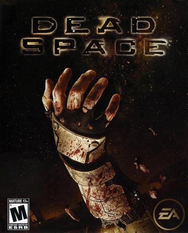
Print media art is the art created for the sole purpose of display on things like posters, packaging, promotional video, franchise etc. It would be cheaper to simply reuse assets already created for the game itself but there are a few problems with this; copyright- they may not have permission to use the assets commercially in any other way other than in the game. And advertisement strategy- it's a lot more flexible in terms of what you can do on promotional posters and packaging if you make new assets rather than reuse old one. The graphics in the game itself might not be all that great, but if the art on the packaging is, this is going to attract potential buyers. While art should not be misleading, as long as it is representative of the game, they are allowed to do this. You will often see little 'not actual game footage' labels in the corner of a video or poster to keep people informed that what they're seeing might not necessarily be what to expect. Good packaging can make or break a game though- advertisement is everything. If a company promotes their game to the wrong audiences, they're not going to get as much custom as they might've done had they made the artwork appeal to the right people. Print media art is not something that solely applies to video games however.. It's also just as important to any media product such as film and music (dvds, cds etc). It's an essential thing to get right, which is why so much money goes into it, and why we often see elaborate covers for games, varying so much in terms of design depending on who they are aimed for.


(An example of print media art. Notice how the cover appeals to the target audience by it's choice of colours and graphics)

Info:

Pictures:
TASK 2 - ARTISTIC STYLES

Photo realisim
Video games usually have a distinctive style of their own however they can all be categorised into one of the four main categories that are Photorealism, cel-shading, abstraction and exaggeration.
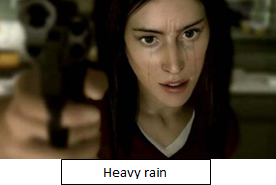
Photorealism is something which you will see in a lot of today’s game, and it is getting more and more popular and advanced as our games evolve with the technology. Just a few years ago we might’ve considered games such as Zoo Tycoon and Lara Croft to be realistic, where surfaces are painted as flat textures onto large polygons. Of course, the computers in modern day can now handle much more and so the graphics have been able to become more detailed; so detailed in fact they can almost be considered as convincing as photographs.. We have also uncovered new ways to create the light and shadow; now using a 3 point bounce system where we previously used only a 2 point bounce system. Because of this we now have games such as Heavy rain, Fifa, Pgr4 etc..
It’s much easier to render an object such as a car or another object realistically, as it’s movement and shapes are generally much simpler- with, for example a human face, the sheer complexity of the muscles involved make making this realistic very challenging. Rendering realistic still images isn’t such so beyond us now.. But the difficulty comes when animating- as we need both the artistic skills and a thorough knowledge of the anatomy involved.
New technologies are new being discovered, in which the intricate details of a person’s muscles and miniscule movements are tracked and recorded in a 360 degree video, making reproducing these movements in an virtual sculpt from varying angles a much more reconcilable task, with more believable results.


http://z15.invisionfree.com/ZT2_Spanish_Dev/index.php?showtopic=500


Cel-shading
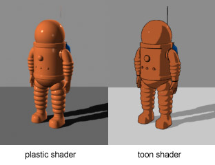
(A basic example of how cel-shaded graphcs are rendered.)
Cel-shading is a artistic style more commenly seen in graphic novels and comics. It's usually used to portray a more cartoonish look, by blocking in very distinctivly where the light would hit and the shadows would cast. As the name suggests, cel-shading is made up of cell-like segments of highlights and dark tones- asthough these segements can be both solid or soft shaded.
A good example of the cel-shading artistic style can be seen at the online graphic novel http://off-white.eu/.
Due to it's cartoonish, oten clip-art apperence, cel-shading can often look like vector art, and often is.

Cel-shading is not only used in comics, but also in games, both 2D and 3D. It's a very efficient way of shading in 3D, especially for rigid shapes with polygon rendering. Due to the simplicity of this type of shading in terms of a more limited colour palate, it requires less memory and so is not difficult for a game to render. This makes it a very efficient choice for reducing it's lag, over some, more complex techniques such as realistic. It is also cheaper to produce.
In order to render objects in real time, with cel-shading, the computer must use an algorithmic formula to calculate the values of colour according to depth, light and perspective. This is similar to any normal way of rendering apart from that the outcome needs to be much more blocked in and have a much more limited range of colours. It is especially important in 3D rendering as the colours or shades need to be smooth in terms of transition and not flickering.
(Above: My own cel-shading attempt)

In 2000, 'Jet set radio' for Sega was released; the first cel-shaded, interactive media product. We now have many other titles that use cel-shading as it's main artist style. This includes things such as 'The simpsons' (2007), and the much more recent 'Ni no kuni' (2013).


Abstraction
Abstraction is an artistic style found mainly in games such as 'Tetris' and 'Osmos'. It involves geometric shapes and exaggerated colours, and does not attempt to be anything realistic. It does not usually pertrain to belong to a storyline and usually has no characters, relying heavily on it's playablity as a game.
It's a very specific art style that would not suit most genres, but is perfect for others; particuarlly ones that aim to put most of the focus on physics or logic puzzles, as another art style such as realistic, cel-shaded or exaggerated might well distract from this.
Other abstract games include 'Anti-chamber', 'Colourblind' and 'SuperHegagon'. As the style is oftentimes simple, and computer generated (thus not reliant on an expensive art budget), games with this style are oftentimes indie development projects.
Images
https://blogger.googleusercontent.com/img/b/R29vZ2xl/AVvXsEhumzUqqR5Qny6xmQeXp0-TI4AVLWyAqnYEtzrtH8CJSLF4T7GuPnihK6_A6dklokyMcd05QqbMX29bVyNGftqa6LH7JJYNQ4Tv1IanwIQWbgBhFhsfoF-YGNqRODJNpNaUniNMPiWet13B/s400/tetris.gif

Info
http://www.giantbomb.com/abstract-art-style/3015-1558/
http://www.quora.com/Video-Games/What-are-some-examples-of-abstract-video-games
http://www.boardability.com/game.php?id=abstract_games
http://www.giantbomb.com/abstract-art-style/3015-1558/games/


Exaggeration
Exaggeration is something found in most game these days- whether that be in the violence, disproportionate figures or scenery, or expressions. The kinds of games that use this style usually have an element of realism about them, but features have been exaggerated or obscured to give it a less serious feel. It's often used in children's games, anime and wii games because it can help to make it feel more friendly and 'fun'.
The style isn't limited to this however, it's also heavily used in what you might consider 'realistic' games in order to enhance and exaggerate the violence. Characters are often changed in design so that they have larger shoulders or arms to appear unrealistically strong. This is quite an arty style, unrealistic, but often with realistic texturing giving it quite a nice feel.
'Rayman Raving Rabbids' and 'Zelda' are good examples of exaggeration.

(Zelda: Combat is heavily exaggerated, using strange colours and lights to enphisize the strike of a sword.)
(Rayman Raving Rabbids: You can see just from looking how the character's appearence is exaggerated here. From proportions, to expressions.)


Images

Info 

TASK 1 - TECHNICAL GLOSSARY

Pixel and resolution, vector and raster images, and file formats/uses


Compression
Compressing files is something done in order to reduce a file size. This could be improtant for things such as making a file small enough to email, or freeing up space on a hard drive. Zipping files are the most common way of doing this. It involves getting rid of unnessesairy information, by reusing old information that can be recalled. A program such as Winrar or Winzip can expand a file back to it's original size, which, if done correctly, should make it identical to the original file again.

Compressing files is also a much more efficient and easier way to share multiple files. As you can compress files together, as well as compressing an individual file, this means that they can be transfered and moved as a group, rather than having to do each file individually.

Image capture devices
This could include things such as digital cameras, video phones, scanners, webcams etc. The most popular and professional equipment in the graphic design industry would be digital cameras and scanners, as they generally have the highest resolution and highest quality outcome. They are used to capture a real life image for digital viewing where it may then be displayed or edited.
Artists might use a scanner to upload traditional work, while a photographer might take a picture using a digital or manual camera with which they could then upload using an SD card or other removable device.

Optimising
Verb
  1. Make the best or most effective use of (a situation, opportunity, or resource).
  2. Rearrange or rewrite (data) to improve efficiency of retrieval or processing.
Optimising in this form, ties in heavily with compressing files. Compressing a file is one form of optimisation, however optimisation could also refer to improving the quality of something as well as reducing file size.

For example, in graphics, it's important to make sure the graphic in question is the correct size in it's raw state on the editing program for it's intended output or display size. Ignoring this important factor could make the difference between a blurry or stretched file.

As for size, as well as just compressing, there are other things you can do. In animated gif files, there is something you can do to reduce overall file size known as 'optimisation'. This trick can be done in programs such as photoshop, gimp and a few others. It works by combining layers, rather than replacing them; it only uses what it needs to, and deletes the pixels from each layer that don't change from layer to layer, the pixels that are not needed as they will not make a difference anyway.

Any images file size can be reduced by making it smaller, reducing colours, changing the dithering pattern etc. While these may reduce file size however, quality might have to be a comprimise.

Storage and asset management
Managing of assets and storing them correctly is very important , especially if you're working with commissions. Incorrect or unorganised management of files may result in losing work, sending the wrong thing to the wrong person, time wasting looking for files. etc.

Managing resources is important in both the long term and the short term;

For example, having a lot of windows open at once is not an efficient way to manage assets while you are working on them. You might end up crossing things off you needed, losing work, or your computer might not be able to handle it and become unresponsive. A nice, clean to the point work area where everything is in it's place is the best way to manage on screen assets. There are shortcuts to make this easier such as ctrl alt tab which allows you to switch from window to window very easily, also task manager which is installed on any windows computer allows you to easily and swiftly manage assets.

In the long term, it's important that files are stored correctly. Creating a liabry of folders and subfolders with corresponding and relevent titles is a great way to make sure you know where everything is. Just spending a few minutes organising and managing assets makes a big difference in the long run. As well as filing things, it may also be beneficial to add comments to files, doing this would allow you to quickly see what a file contains at a glance without having to actually open it.

A backup system whereby regular backups are made is important incase assets are accidently lost, deleted or even stolen. Backups should be titled and dated so it's clear how old they are. After a period of time, old backups that are no longer of any use can then be deleted to make room.

Making new files all the time can make things get very messy, making things difficult to find. So it's essensial that just a few minutes are spent cleaning things up, deleting files no longer required, and moving things into the right place. It's a bad habbit to leave things lying around on the desktop for example; while they might be easy to access from there, they could quickly build up and get very messy, besides which, it's just as easy to make a shortcut to a more remote file for easier access.

Info:
http://computer.howstuffworks.com/file-compression.htm
http://windows.microsoft.com/en-gb/windows-vista/compress-and-uncompress-files-zip-files
http://www.techterms.com/definition/file_compression
http://www.dummies.com/how-to/content/compressing-files-to-ease-emailing.html
http://www.macworld.com/article/1143001/imagecapture_tricks.html
http://en.wikipedia.org/wiki/Camera
http://www.thefreedictionary.com/optimising
http://www.assetbank.co.uk/digital-asset-management-software/
http://en.wikipedia.org/wiki/Digital_asset_management

Images:
https://blogger.googleusercontent.com/img/b/R29vZ2xl/AVvXsEhJlaAal37LGzwDnsdVR8umNqQfO1NqlTD4Ng0-J10qqTcXc2qs1Bs0KvtNztqkkR8a-IFeSLbFoiwp8oYuDRcD-aDRDU37AlJvGf0Ai-705VkTRCEKYH-K49H-3xg0CtRPlbvrkx3VzisG/s1600/Grand-Theft-Auto-San-Andreas-875.jpg

Tuesday 26 February 2013

TASK 3 - EVALUATION

My project began on the 5th of November 2012 and should have been completed by the 6th December. Unfortunatly, I did not hit that deadline. Although this was mainly due to outside influences(Absent tutors, computers/software at college not working etc), I realise that the completion of this project was my own responsibility and I have learned from this experience that I cannot rely on other people and must, in the future, make room in my time plan for unexpected occurances out of my control.
I think I dedicated the appropriate amount of time to each task within the project. For example, task 1, was mainly the research process, which consisted of visual research, mindmaps, moodboard and digital scans of hand rendered sketches. Producing these documents was the first thing I did, as, logisitically, I knew I wouldn't be able to do anything else until I had a firm understanding and plan of what I needed to do. It would be easy to spend too much time on this task as it depends on how in depth the research is, but I spent no more than a couple of weeks on this. What, in my opinion, was just the right amount of time for the quantitiy and quality I was aiming for.
After the research, I could finally start on task 2; the actual production of the concept art. This included, both vector and raster. I could have done it in any order but I decided to start with the vector image using illustrator.
Most other people in the class started off with the bitmap version, and then simply traced over it for the vector version- as I did it the other way around I may have made things a bit harder for myself.
I found using illustrator reletively easy once I got used to using the pen tool and the beizer curve.. I made use of layers so that I could put an image I took myself underneath, set the transparency low and use it as a guide for anatomical and pose reference. The colour palate also came in very useful for quickly refering to colours and finding darker and lighter varients. I used blocked in paths and then softened them to get a nice gradient effect for the hair.
There were many raster editing softwares I could have used but I chose to use paint tool sai for it's nice smooth lines and versatility. Like photoshop, this editing software makes use of layers and layer modes and I used this to my advantage. I used a cel shading technique to complete my bitmap and later also added a background.
Overall, I am pleased with my performance and final pieces. I think I completed the task in hand throughly and within reasonable but not great time limits. Where I to do it again though, there are things that I would do differently.. For example thing's would've been much more organised if I had arranged my time table better to allow for unexpected delays and also if I had made my raster version before my vector.

I began my work by writing up a quick mindmap and short description of my interpretation of the character I had chosen to give me a rough foundation or base to work off and a place to use for inspiration or reference.
Knowing that steampunk, the character and its storyline were all based in the Victorian era, I thought it necessary to get a good realisation of the fashions around at that time.
To delve further into this I wanted to get a good grip on exactly what steampunk was and to start getting an understanding of how this could be applied to the design of my character.
With the Victorian and steampunk research in mind, I started to collate images of other people’s interpretations of characters with similar themes. I knew that using this would provide the necessary inspiration and give me some ideas of how to design my character in terms of clothing.

Using my mindmaps, moodboards and various references I began to sketch up a few simple ideas. At this point I was trying out a few different things to see what both looks best and gives the correct impression of the character how I would like her portrayed. I had to take into consideration her age, background, class etc as well as the fact that she is a ‘goody’ and the period in which she lives in.

I took one of my sketches and used this as a basis for my vector drawing.
 Began work in illustrator, using the pen tool.
I put an image which I had taken on a layer behind the layer I would be drawing on. I then lowered the transparency of the layer so that I could trace over the figure with the pen tool., whilst still being able to see the shapes and shading.  

I started off the colouring process by adding block colours. I could've waiting until I had finished all the lining to do this, but I decided it would be best to do it as I went along so that I could more easily seperate shapes/for more flexible editing.
I couldn't trace over the image completely as this would not have complied with the original genre, so I began to add more clothing in from my imagination, using my sketch as a reference for this. I also used the pen tool to create shapes (Without outline) which allowed me to add in highlights and shadows. As this was vector, I thought it would be a nice idea to use the cel-shading technique for this.
More tracing, started to add shading and highlights. 
Shading was too prominent and needed to be reduced. Chin was uneven. 

Altered the shape of the jaw, removed and retoned some of the shading. Made the shading on the hair softer. Made the outlines a darker shade of the inside colour rather than black. Added necklace accesory.

Continued making touch ups and extra shading, then finally came to a finish.
Decided to start work on the bitmap. Using the photographs I took of myself as pose reference, I sketched a rough idea of what I wanted.

Now using the sketch as reference, and the other images as anatomical reference, I started carefully inking my image. Most people used photoshop but I decided to use the bitmap software known as 'Paint tool sai' for it's efficient interface and appropriateness for the task at hand. It was ideal as using this meant I could work from home.

For the lining stange, I used a tablet to make nice lines that varied in thickness but not opacity. I then used the eraser tool to clean up any stray or messy lines.

 I decided to change up some of the clothing items and things, after all, as concept art, the whole idea is to try out different ideas.

With a grey brush, I went around all the lines, filling it in so that I could use this as a mask so I wouldn't go out of the lines.

Added some base colours, making some of them transparents as I knew I would be adding texture under them later that would alter the colours anyway. Tried to keep it consistant with the vector drawing to a degree.

After blotting in the shading, I added some texturing using real images to give it a more detailed feel.

Got a background off deviantart stock and filtered it to change the colouring to go better with the character.

Added a black fade at the bottom of the picture to give it more depth and giv the illussion of a base of floor.

Got the mask I made a while a go, transformed it so that it lay at an angle and adjusted the opacity to make it more like a shadow.

Dublicated the shadow, and cut off the top part, then increased the opacity so that the shadow started off darker and got lighter to give it more depth.